Visualising Network Connectivity
Creating clear and engaging network maps for The Loop's fibre-optic services.
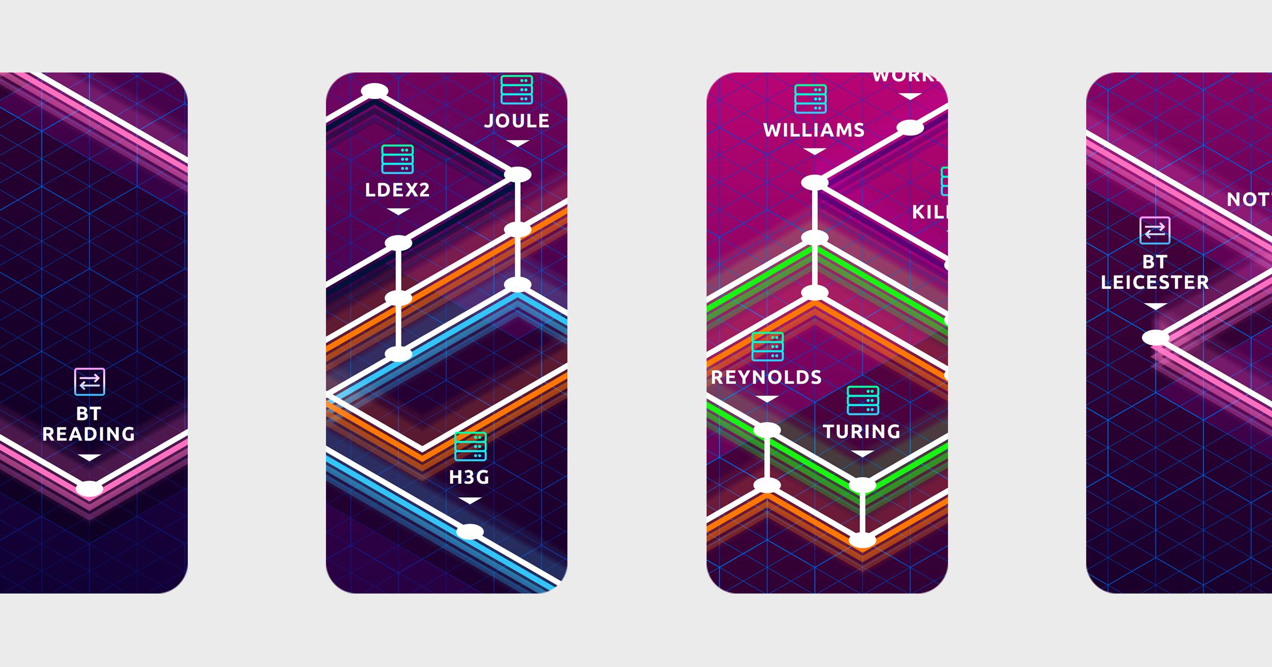
Innovative Network Mapping Solutions
Enhancing digital engagement through stylised mapping.
We partnered with Gamma/The Loop to develop visual network maps that not only detail their extensive fibre-optic infrastructure but also serve as effective marketing tools. Our design transformed complex data into visually appealing, easy-to-understand graphics.
These maps, crafted with meticulous attention to colour, patterns, and icons, offer a streamlined user experience that facilitates understanding and promotes the infrastructure’s capabilities.
Client
Scope

Brief
The Loop required a solution to represent their expansive network in a way that is both informative and engaging for potential clients and stakeholders.
The challenge was to synthesise detailed technical data into graphics that are intuitive and marketing-friendly, supporting both digital and print media.
Strategy
Our strategy focused on developing a unique visual language for The Loop’s network maps, similar to stylised transit maps, which are known for their clarity and ease of use.
We concentrated on creating a user-friendly interface that simplifies the complex nature of fibre-optic networks, making it accessible and shareable across various digital platforms.


Solution
We designed a series of detailed maps using distinct colours, patterns, and icons to denote different network segments and services clearly.
The design was implemented with a focus on digital usability, ensuring that the maps are not only visually engaging but also function well on various devices and in different formats.